Friday, December 31, 2010

Flight of the Fairies

I am excited about my latest custom order.  I have been extremely fortunate to land one big custom order per year and this one will be 2011’s.  This order is special to me because the card chosen is a fairy birthday card that features my own original fairy die cut.  The only problem is that I don’t carry enough supplies to make many duplicates of the same card.  I actually bore easily of repeat papers.  Normally, that trait works out well for handmade items!  There are rarely more than ten of any design I make with most designs not surpassing six.  This time, though, I need to make a hundred!

Here is the original card that sparked the order:
While I bore quickly of the same paper patterns, I do like to reuse layouts.  Even when I scrapbook, I go back through my pages and will repeat a layout I had that I especially liked.  By varying the colours (and sometimes the page elements), I can get what I think is an equally pleasing yet different design.  So, that’s the solution for this custom order.  Fae, fae, everywhere in different colours and patterns so fair!  Using the same design in many colours makes this project 10 times more interesting for me!

Here are some examples of varying colour schemes (click for larger views):
Grey Spotlight

Urban Garden


Grey Oppulence

Whilst cleaning up my studio, I’ve realized that I tend to buy papers in sets of two or four.  (Surely, this is a scrapbooker’s habit!)  With only 2 to 4 pages of any one design, that means A LOT of combinations to make 100 cards!  I do have a lot of paper though.  I pulled enough paper from my stash to fill half the order and I ran out and bought some papers from a line I've been itching to try for the rest!


Naming these fae cards has also been fun!


Teal Treasure


 Fireside Fairy

I have to admit, I jealousy hoard some of the papers.  I hang on to the ones I find especially pleasing thinking that I will use it only when that *perfect* project comes along that just *deserves* this paper.  Well, this holiday, I have been re-arranging the studio for better workflow.  (I mean, I have an entire room for my stuff but the space I have clear on my desk to work in is only 1 square foot!)  So, while reviewing my goodies and finding more suitable homes for them in my room, I have also taken a hard look at the protected stash.  I have chosen to part with some of my favourite papers just for this project.
Here’s one of them:
Linen Closet

I just love the main paper on this card.  It has a very fine and delicate look to it with a hint of innocence.  Nonetheless, its time has come!  This paper will fly away with the next contingent of fae by the end of January.  Everybody wave good-bye!

Saturday, December 25, 2010

Merry Christmas 2010 - Naughty or Nice?

Merry Christmas to all!

This Christmas, I made something for the Executive Administrators in our office.  There are a total of 9 of them.  Professional Administrators' Appreciation Day is in April.  Well, for a chartered accounting firm, April is an extremely busy time of year.  I wouldn't have time to make handmade gifts then, so I choose to give them something at Christmas.

I had seen a poem last year about reindeer and snowman poop.  I altered the lines only slightly to make my gifts.  Some of the people in our office can't have chocolate, so they got mints instead.
I saw a tutorial for this box on Splitcoast Stampers. That box was made from one sheet, which meant the bottom of the box was a single layer.  I needed a more reinforced box to hold heavy chocolate almonds and mints.  So, I redesigned it so that the basket is made from one sheet and the tongue is a second sheet.  That way, I have at least two layers all around the basket.
The snowman papers are from Dream Street and the reindeer papers are from Die Cuts with a View.  I had made something over a year ago that produced all these extra white circles.  I made them into snowpeople for my boxes.  Two were for men, so they have top hats.  Two were for women so one has ear muffs and one has a tuque with a pompom on top.  I designed all the paper die cut hats myself.  The reindeer is a stamp from Stampin' Up.  (I bought it last year just for this purpose!)
Here is my version of the poem.  (Click for a larger view.)  Here is the original version of the poem:

I heard you've been naughty.
So, listen, here's the scoop.
Santa's going green,
So you get reindeer poop! (or snowman poop)
- Santa.

I didn't like that the poem didn't make the connection between lumps of coal and going green.  So, that's why I altered the poem to read:

I hear you've been naughty
But, this year, coal won't do.
To reduce my carbon footprint,
It's reindeer poop for you!  (or snowman poop)
- Santa

The admin seemed to like their gifts.  I'm quite happy with how they turned out!

Saturday, December 18, 2010

Come rain, snow or shine! Snowman card for the Post office

I really like my post office.  It's near by and the workers are knowledgeable and never grumpy.  I hear lots of horror stories of misinformed and nasty postal workers around the continent on various forums.  I feel lucky that mine are very steadfast.  I sometimes even get service with a smile too!

I had an extra paper die cut snowman.  (This one was my prototype.)  I attached him to a card, which is also made from scraps of another project, and I will be bringing him to the post office on my next trip.  I happened to get a large custom order from my iCraft shop, so I want to bring in my snowman when I show up with a big fat parcel, proud as a hen with a barn full o' chicks.

I have used this paper from Jillibean Soup on several cards.  I LOVE its neutrality and it matches Bazzill Fawn cardstock to a T!  When I give cards to people I don't closely know, I like to keep it non-religious.  (You never know who does and does not celebrate actual Christmas.)  I was not sure how the detailed, elegant paper would pair with my whimsical paper die cut snowman.  I think, with the whimsical stamped sentiment (from Michael's), it turned out nice!  In fact, I might make a couple more.  I still haven't finished sending Christmas cards.  Just like last year, the last batch will certainly be late.  (Better late than never though!)

Sunday, December 5, 2010

One of a Kind - Nun of a Kind!

This year was the first year I attended the One of a Kind show in Toronto.  The number of booths of artisans and crafters was mind boggling.  We started at row Z and by the time we stopped for lunch, I was only at row Q!  I thought I wasn't going to get through it all in one day! (But I did).

I went this year to meet the creator of Nun of a Kind.  Linda, the creator, was kind enough to share with me a couple of her extra exhibitor tickets. Small world, you know, she lives in a place neighbouring my hometown of Sarnia!  So, we had taken to chatting and reading each others' blogs.  I purchased a few Sisters for the ladies in my life a while ago (and one for myself, of course!).


Here's a picture I snapped of the booth.  If you click on it, you can get a MUCH larger view.

Linda, the maestro behind Nun of a Kind,  is over at the podium checkout and her friend Cathy helped man the booth - or woman the booth, I suppose!  Cathy is also an accomplished sewer as you can see from her Etsy shop: ZigZagStitches.

What I love most about the Sisters is that it celebrates, in a very fun, creative, light-spirited way, all the different things women can be.  Also, the idea of Sisters is so encompassing of any womanly relationship you might have.  There is an inclusivity and belonging to The Nunnery that is a feel-good kind of thing!

Several nuns debuted at this show.  One that was entered in to the "Love" exhibit at the centre of the show was the Sister who loves to cook: "Amelia Love".
You can just see her from the back of my photo here.  She has the giant poofy white chef's hat on over her habit.  Totally adorable!

In the back row are the holiday items.  I bought a Santa for myself.  I really liked the white ones, but there was one with a little polar bear that I had to have.  So, I went for red so the polar bear stood out more.  I got a little Frosted Folk to be my white winter wonderland piece.  The Santas are just superb - having a light filling, they have just the right amount of weight to stand up sturdy.  Another artisan at the show (who made fabulously detailed fairy figures) asked to see my Santa.  (His head and hat were sticking out of my bag and the jingle bell rang wherever I went.)  He was impressed with how well it stood up too!

Nun of a Kind is one fabulous way celebrate and support sisterhoods everywhere and I just wanted to share!

Thursday, December 2, 2010

Snowy Blues

No, I'm not down in the dumps and no, it's not snowing yet (thank goodness!) but over on the Crafty Ho's challenge blog, this week's challenge is an inspiration photo of a *very large* snowman.
Last year, I designed a die cut snowman.  I wanted him to look like folk art.  I didn't like how he turned out.  I went back to the drawing board on this one.  Once I had the new snowman paper die cut designed, I saw the error of my ways on the first one.  I gave him some touch ups but I have not yet made anything with him.  Once I finished the new one, though, I was ready to make something with him right away!

I made life easy for myself: I found a sketch challenge to go with this snowman theme.  The sketch is from the Card Positioning Systems challenge blog for CPS 195:

In addition, I experimented with monochromatic colour schemes in my last post.  In keeping with that idea, I made this card monochromatic too.  This time, instead of using different shades of the same family, I used the exact same cardstock and differentiated the layers using embossing patterns.  This card, therefore, also qualifies for the PaperPlay Monocrhomatic challenge this week!  Woohoo!  Three challenges in one card!
This is my chubby little paper die cut snowman!  I gave him a black outline to make him appear more bold.  It does add a slightly whimsical cartoon-y effect too, which contrasts the embossed simpleness a little.

I'll tell you a secret about this card: Once I did the black background, I didn't know what colour to make his hat!  I don't have a dark gray cardstock, so you know what I did?  I coloured some white cardstock grey with my Letraset Tria alcohol-based markers.  Worked well, I think!  Here's a close up of the embossing.
I used Stampin' Up! ribbon on this card.  I must admit, this ribbon is MUCH nicer to tie in bows than dollar store ribbon.  The quality is recognizably better by far.  I don't think I will ever buy another spool of dollar ribbon!

This paper die cut snowman is going in my personal pile of Christmas cards.  Someone I know will be getting this little guy!  I haven't picked who yet though.  If I ever get around to cutting out the folk art version of my paper die cut snowmen, I'll try to remember to snap a picture to show you before I send him on his merry way!

Sunday, November 21, 2010

I { heart } tea!!

Today's blog post is a challenge duo!  I made a new paper die cut and was eager to use it on a handmade card.  I am happy to announce that my design fit in to *two* challenges!

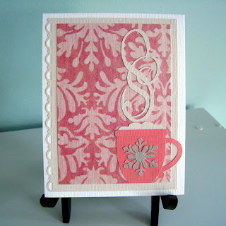
I was inspired to draw a new paper die cut.  I was sitting quietly in the living room with my giant cup of tea.  I mean *giant*.  My husband and I get Mandarin take-out with a some regularity.  We use the canvas bags for our grocery bags.  Now and then, Mandarin sends a free gift.  We've gotten a couple of bowls that are perfect ice-cream bowls and a I have a trio of mugs.  BIG mugs.  I love them.  Who invented the tea cup?  That's much too small to hold enough beverage to warm your insides.  I think I could drink that in 2 gulps.  Give me a mug!

So, I decided to imitate the shape of my Mandarin mugs as a die cut.  (I embellished the handle just a tad.)  I wound up with this mug:

I decided to keep these cards monochromatic.  It's easy, yet effective.  I love how everything just goes with everything on a monochromatic card.  The pink paper is old.  Very old.  It's been in my stash for at least 3 years.  It's from the Die Cuts with a View "Luxury" stack of pearly patterned cardstock.  I'm so not a fan of pink and I only have nephews, so I have never been drawn to use it before now.  (Actually, looking at this card again, it might make for a nice breast cancer awareness card if I swap out the snowflake for a ribbon.... hmmmmm.)

The snowflake is a design by Boss Kut.  It's easily one of my favourite snowflake designs.  I used it here to qualify for the PaperPlay challenge, "Let it Snow".  The fact that the paper is some older stock of mine qualifies this card for the Etsy for Animals December 2010 challenge too, "Out with the Old".  Those challenge entries will be posted to the EFA Challenge Blog during December.  As part of my EFA entry, 15% of the sale of this card will go to the Southern Ontario Animal Rescue.

I decided to make a couple more.  One is in the same colour scheme and one is blue.  These cards are more generic: they work for "warm wishes" or as coffee/tea invites or even plain "thinking of you" type cards for the coffee or tea lover.  Here's the pink one.

The steam on these mugs is actually made from two manipulated "S's.  I chose a script-style font in my Boss Kut Gazelle's software.  I used a couple and layered them, rotated them and then pulled them all funny ways.  Here's the blue one.

On this one, I used paper quilling for the steam.  I like it, but I think I like the die cut steam better.  It fills the card more.  I could play with more quilling, but I didn't have long enough strips at the time.

I put hearts on these mugs - mostly for me because I {heart} tea!!  I could put other things, like the breast cancer ribbon.  What else?  Got any other ideas?

Tuesday, November 16, 2010

Copic vs. Letraset

I think I'm getting it: this marker blending thing.  I volunteered to donate some cards for a Donkey Sanctuary outside of Guelph, Ontario, Canada that has a shop.  I'm using Meljen's Designs Sweet Little Donkey digital stamp freebie (with proper copyright on the back!).  I'm going to make just a small handful of 5.  The plan was to make 2 grey and 2 brown donkeys.  Whichever one I liked better, the fifth one would be that colour.

Enter: the marker experiment.

Letraset
So, I have these old Letraset markers from my highschool days when I wanted to be a comic booker writer and dabbled in drawings of that nature.  I *think* mine are the Letraset Tria markers.  Mind you, I bought them probably 15 years ago and they have sat idle for about 12.  The ultra fine nib on some have dried up.  I stored them on their sides though, so if I kept them with that point down for a while, they might moisten up again.

These are neat because they have 3 tips on them.  That ultra-fine tip is sure handy.  When you need to refill, you keep your tips and change the cartridge (the barrel of the marker).  No fuss, no mess.  I've been hearing a lot about these "Promarkers" and the "Passion for Promarkers" challenge (which I heard about through this design team member's blog: My Little Space on the WWW).

Well, shiver me timbers, I had NO idea that these are the SAME kind of markers I've had in disuse for over a decade!  I always called my markers the "Pantone" markers because the sticker says that.  Then I noticed that it also says, in a smaller font, Letraset.  So, after my little experiment (we're getting to that part!), I went to the Letraset site and what do I find amongst their product line-up?  Promarkers!  I kind of felt like I'd won some crafter's lottery having chosen to cart these with me all these years instead of tossing them.  Woohoo!  I have a decent number of them in an old Kettle Creek purse (the canvas one that looks like a mini duffle bag.  Anyone remember those??)

Copics
I also have a handful of Copic Sketch Markers.  These are all the rage right now in the stamping world.  I saw the samples in the local scrapbook stores and decided I would give them a whirl.  I didn't want to buy a whole bunch, because they are costly and what if I didn't like them?  So I bought colours I thought were the most used.  Well... that doesn't make for blending very well if I don't have a whole mittful of colour families.  What was I thinking buying colours on a sporadic basis?

Lo and behold, the smell is reminiscent of my Panto.. Letrasets.  That's when I dug out my old markers - to try blending them with copics.  It actually worked not bad!  Yippee!  So my silly random copic purchases weren't totally useless!

I haven't had to do it yet, but the Sketch markers refill with an ink bottle.  So, you keep your whole marker and just pour more ink in.  (There are actually 3 ways to get the ink in it.)  Sounds messy to me, but we'll see when I get there.

The Experiment
Okay, back to the Sweet Little Donkey.  I happen to have only 1 grey Copic.  So, I dug through my purse of Letrasets and find that I have whole family of greys in them.  So, I coloured the grey donkey with Letrasets.  I have since purchased enough brown Copics to do some blending.  So, I did the brown donkey all in Copics.  Here are the results.

The grey Donkey started out all filled in with light grey.  Then I added a darker shade where I wanted shadow.


Then I coloured over him entirely with the light grey again, even where I put the shadow.  I think it blended pretty nicely.  (Much better than I ever blended it back in highschool.  According to my old sketchbook, I obviously didn't "get it" then.)
Then I coloured his mane and tail tuft.  His hooves are the darkest grey.
These are the colours I used: From the "Cool Gray" family, I used 3-T, 6-T, and 8-T.  The hooves were 432-T and the pink is 169-T.
And here it is on a card.  I like the colours of dark brown and light green.  It makes me think of mint chocolate.  MmmmMmmMm.  (The sentiment is from Stampin' Up!)

The brown donkey started out the same.  I first coloured it all with the lightest brown.  Then I filled in some shadow areas.
Then I went back over it with the lightest brown again.  With the Copic, I could see the blending happening.  The darker colour actually changed the more I went over it.
 
It turned out pretty nice too after I coloured the mane and tail tuft with a darker brown and the hooves with the darkest brown.
These are the colours I used: E33, EE37, E29, E49 and the pink is YR00.


Here it is on a finished card.


The Conclusion
I have to say, it was definitely harder to control the Copics.  I had trouble staying in the lines with the brush tip.  I wish my type of Copic (the Sketch Markers) could have the fine and super fine nibs, but it appears those are only available for the original Copic barrels.

In the end, though, I felt the Copics blended better.  Mind you, I'm not sure how 12 years of disuse affected my Letrasets, if it does at all.  The Letrasets gave a crisper, smoother finish and you can clearly see where the darker shade fades to the lighter.  The Copics moved seemlessly from one colour to the next, however, it's not as crisp a finish.  It shows like a "mixture" of tones on the paper rather than the crisp tones that the Letrasets gave.  I do like the mixture effect for the donkey though!

If I had to describe them, I'd say the crisp blending by the Letrasets brings the comic book and cartoon look to mind, whereas the melded blending by the Copics looks more like painting.


I am by NO MEANS an expert colour-er or expert blender.  I am pretty much a novice with both sets of markers.  Personally, I think BOTH have great blendability.  I would be happy to spend my money on either set.  Copics are hot right now, so seem more readily available (at least in my area), but I'm still going to hold tight to my Letrasets!  The longevity is amazing and the result is equal in quality to the Copics, although the two produce a slightly different end look.

Which one do you like better?

Sunday, November 14, 2010

Fairy Merry Christmas!

I've had this digital image of a fairy christmas bauble for some time.  I got it from "Digital Doodling" some time last year.  It was free and I had to have it as soon as I saw it.  Not being a big stamper, though, I never used it before now.

When I saw sketch #164 for Mojo Monday, I knew this bauble was the perfect fit!  here is the sketch:

And here's my card:
Yes, I snuck in some more embossing!  I also love my Stampin' Up! stitch piercer for faux stitching.  I tried to make it look like the two patterened papers were stitched together.  Here's a closer look at the fairy bauble, which I coloured with Copics.  I also put frosted lace stickles in the wings.

This was my second attempt at using this bauble, actually.  The first bauble I printed was too big for the sketch.  Here's what I did with that one:
I have this stack of holiday papers by Die Cuts with a View.  Some of the papers are very vintage looking, which is just not me.  I have to think hard on ways to use them.  This one seemed to fit the image perfectly - plus the bauble blocked out JUST enough words to leave me with "magical" and "merry".  PERFECT!

Because this fairy bauble is bigger, I was able to do a little more shading wtih my copics on this one.
Hope you enjoyed these two fairy merry Christmas cards!

Thursday, November 11, 2010

Pure Purple Holiday Ornaments

Before we get to the Christmas cards, I first want to say a note of thanks, on this Rememberance Day 2010, to the soldiers of days past who fought for my freedom so that I wouldn't have to kow the tears and terrors of a war-torn world.

Thank-you for your conviction, your courage and your sacrifices.

Without you, my life could have been very, very different.

*************************************************

Now, we kick off the Christmas card season!  I wanted to play in the Clean&Simple fall-to sketch challenge #115 this week.  My Christmas card follows this sketch:


You can do a lot with this one: Leaves, snowflakes, cupcakes, candles, mittens, stars, wrapped gifts, gingerbread men! - lots and lots of things!  I chose to do ornaments.  The Just Cute Bears Challenge #39 for the same week is "black, white plus one other colour".  I didn't have bears that I could do in repetition, so I can't participate in that challenge but I did use the idea!

This Christmas card is a mix of handstamped plus a paper die cut.  I had to use my stamp-a-ma-jig from Stampin' Up! to get those ornaments placed.  I also used the perfect polka-dots embossing folder on the paper die cut ornament.  (I finally own that embossing folder!)

I like the non-traditional Christmas colour scheme here with the purple.  I'm still finding my stamping legs, but I will never abandon my paper die cut passion!  What do you think?  Is this a happy mix?

Sunday, November 7, 2010

Halloween House 2010

Had to sneak this post in before I become buried in Christmas card making.  That's right, Fairy Cardmaker's Workshop is gearing up to make Christmas cards.  Last year, I left it to the last minute and I only sent about 6 or 7 handmade ones.  This year, I want to get out 10-15 to the people I know will appreciate them.

But that is for another time.  Right now, I want to show you spooky stuff!  My husband is born on Halloween.  When we first got together, he used to bah-humbug giving out candy to other people on his birthday.  By the time we bought our first house together, I convinced him that Halloween is a time for fun!  Costumes and make-believe and being inventive and creative (pumpkin carving, decorating, etc.)

Well, now he gets a real kick out of doing our house up scary.  (The only way to do Halloween because he doesn't believe in cutesy whimsical Halloween.)  The ghoul at our front door sometimes blows in the wind.  The rags drape over our trick-or-treaters and some give it a wide birth!


The new addition to our decorations this year is the severed head.  (Personally, I'm not that fond of it.)  I begged my husband to put it somewhere not right next to the door.  I was sure the little kids wouldn't want to go near it.  He hung it up high, but it was actually too high to be noticed by many.


Our famous legs are in the next picture.  We've had these since the first Halloween in our first house.  It's just an old pair of jeans, stuffed with old runners tied on to the legs (through holes we put in the ankles of the jeans).  He usually lives under the garage door, but hubby decided to crush him with the engine hood of his car this year instead.


My husband had a robe and a ghoul mask and hands as his costume for our first Halloween.  Masks are not really that comfortable to wear, so it has been in disuse ever since.  This year, he found a use for it.  He dressed up a 5 foot tall skeleton and put him at the wheel of the car.  He had a strobe light in the car to light up the ghoul come night time.


Everyone's favourite, mine, my husbands, and all 140+ our trick-or-treaters, is the  skeleton in the ground.  He also has his own, private spotlight strobe light.  Many costumed children pose next to this fellow for their hoilday photo op.  It is very satisfying to my husband to be the "tourist" house on the street!


Last year, I carved our jack-o-latern using my own spider pattern.  (Click here to see it.)  This year, hubby was adventurous enough to try carving from a pattern himself!  One parent wanted to get a photo of her little girl sitting on the bench with the pumpkins.  Funny, the little girl walked past the skeleton coming out of the ground, the ghoul in the car, and the banshee at the door without a problem, but she didn't want to go anywhere NEAR the jack-o-latern!

My mother-in-law also got in to the carving action and made a pumpkin from a pattern this year too.

 All in all, our house was a hit.  Both my parents-in-law (who live in the basement apartment) and we contributed to the candy pile.  We give our candy from a giant plastic cauldron.  We easily had 2.5 cauldrons worth of candy.  We gave out about 1.75 cauldrons full.

Last, but not least, I wanted to show you the mini-pizza boxes I made for my nephews.  Each one is only 2x2 inches big and 1 inch deep.  I put some chocolates inside.