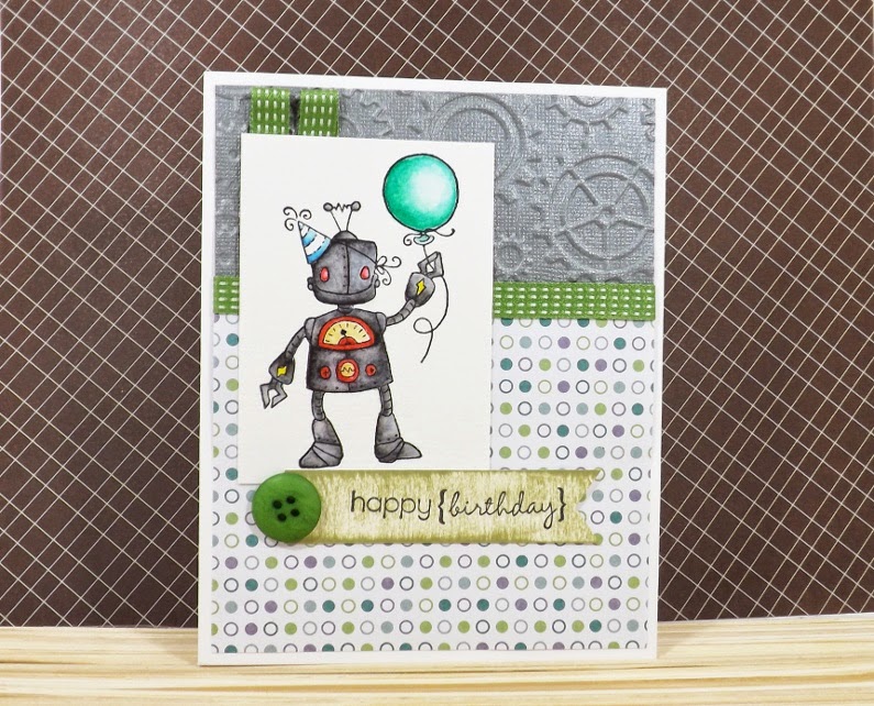
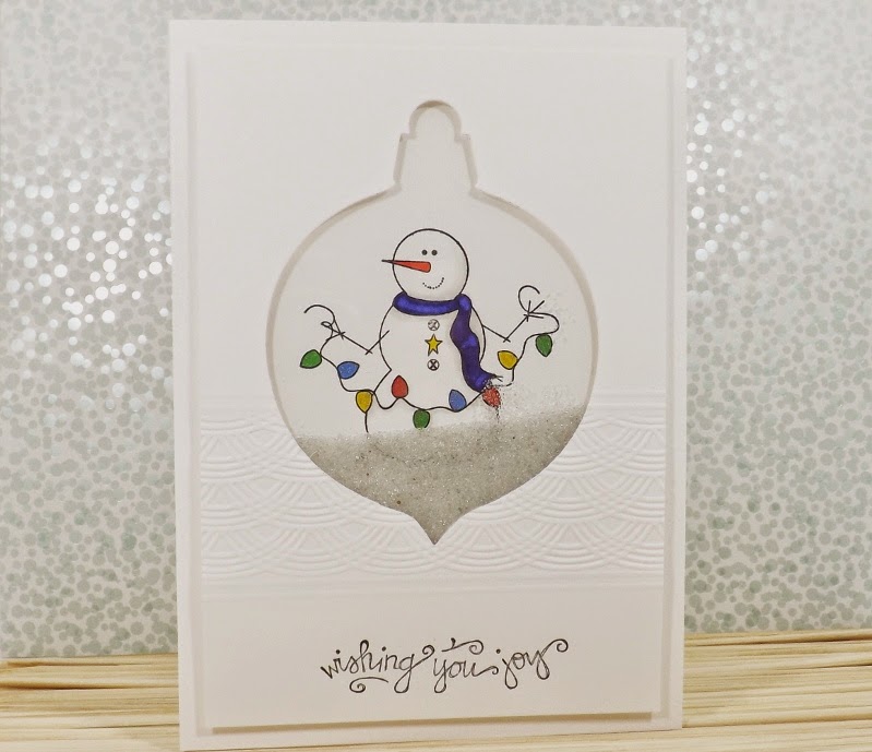
A while back, I picked up a set of Bic Mark-It alcohol markers. When I got them home, I wanted to compare them to my Copic Markers. I also purchased a pair of alcohol markers from Close to My Heart. (The CTMH ones were sold in pairs: a dark one and a light one of the same tone. Now, CTMH sells Shin Han Touch Twin alcohol markers now instead.)
So, I coloured some butterflies up and I'm going to share with you how it turned out.
I did not have all the exact same colours, but I tried to get them close. I like teal, so that's what I tried first.
On the left, we have the Copic markers: BG10 and BG72. (Normally, you wouldn't blend a 1 and a 7 in Copics but I eyeballed them in the store and I thought they worked well together.) The copics blended the best.
In the middle, we have the CTMH markers in Twilight. I found the gap between the light and dark to be quite large. Even though you can see the two tones quite clearly, I think I managed to get them to blend well enough.
On the right, we have the Bic Mark-Its in Tranquil Teal and Hot Aqua. These take a little longer to get the blending effects to work. Again, these two colours were a little farther apart then I would have liked, but I think they still blended nicely. I'm quite happy with my purchase of the Bic Mark-Its. It's great value for money and a great way to experiment with alcohol markers. Even though one of my markers came out bone dry and, when I sent it back, they sent me free stuff but not the marker I needed because they were out - despite that, still good value for money.
I wanted to see what other colours I could marry up in the Bic Mark-Its, so I tried some other combinations.
On the left, I used Pink Flamingo and Desert Rose. On the right, I used Fandango Pink and Plumtastic Purple. (What?) Yeah -
purple and hot pink. Based on the cap colours, I would not have tried these colours. However, I know that cap colours are not always perfect. So, I pulled off the caps and tried them on a piece of scrap paper and I really liked how they worked together. They were farther apart then I would have liked, so I did have to work at it a little bit. It worked with the teal, why not with the pinks, right?
Here's a closer look at them.
They came out remarkably similar. The purple served to create a darker shade but, really, these two look like they came from a consecutive array of colours.
These are all great markers. I still notice that the Copics are a cut above but, are they so far ahead as to justify the price? Perhaps not for the casual crafter. (Totally for the serious artist though - and those who enjoy imagining we're one!)
Happy Colouring!


